
Chicago Avenue Fire Arts Center (CAFAC) / Branding & Collateral
Catching Fire.
Heat. Spark. Flame. Artists who use fire in their work harness these powerful forces to make equally powerful art. We partnered with our friends at Chicago Avenue Fire Arts Center (CAFAC) to forge a new brand and visual culture. The Fire Arts Center is the only education and artist support facility in the Upper Midwest completely devoted to the fine and industrial "fire art" forms such as sculptural welding, blacksmithing, metal casting, jewelry making and glass working. As CAFAC approached their 5th anniversary, the new logo and look is a celebration of what they have become and the people and community that they so proudly serve.
Work & Credits
Our Work: Discovery, visual brand identity, collateral & signage
Photography: Various CAFAC partners, friends and supporters
Client CAFAC


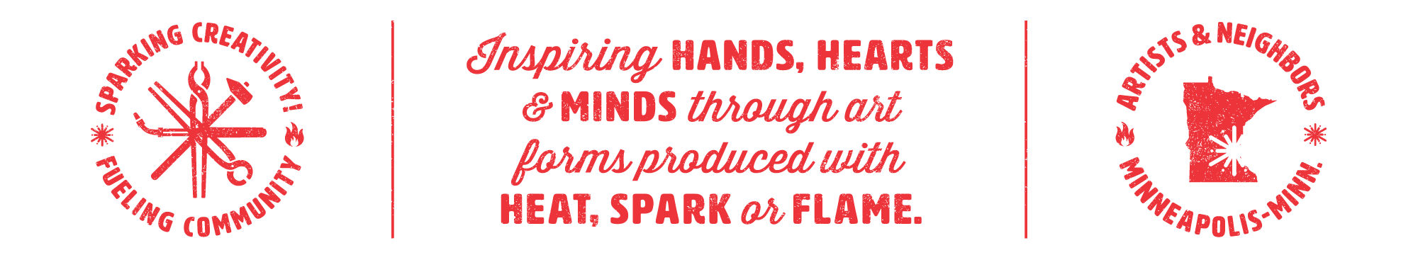

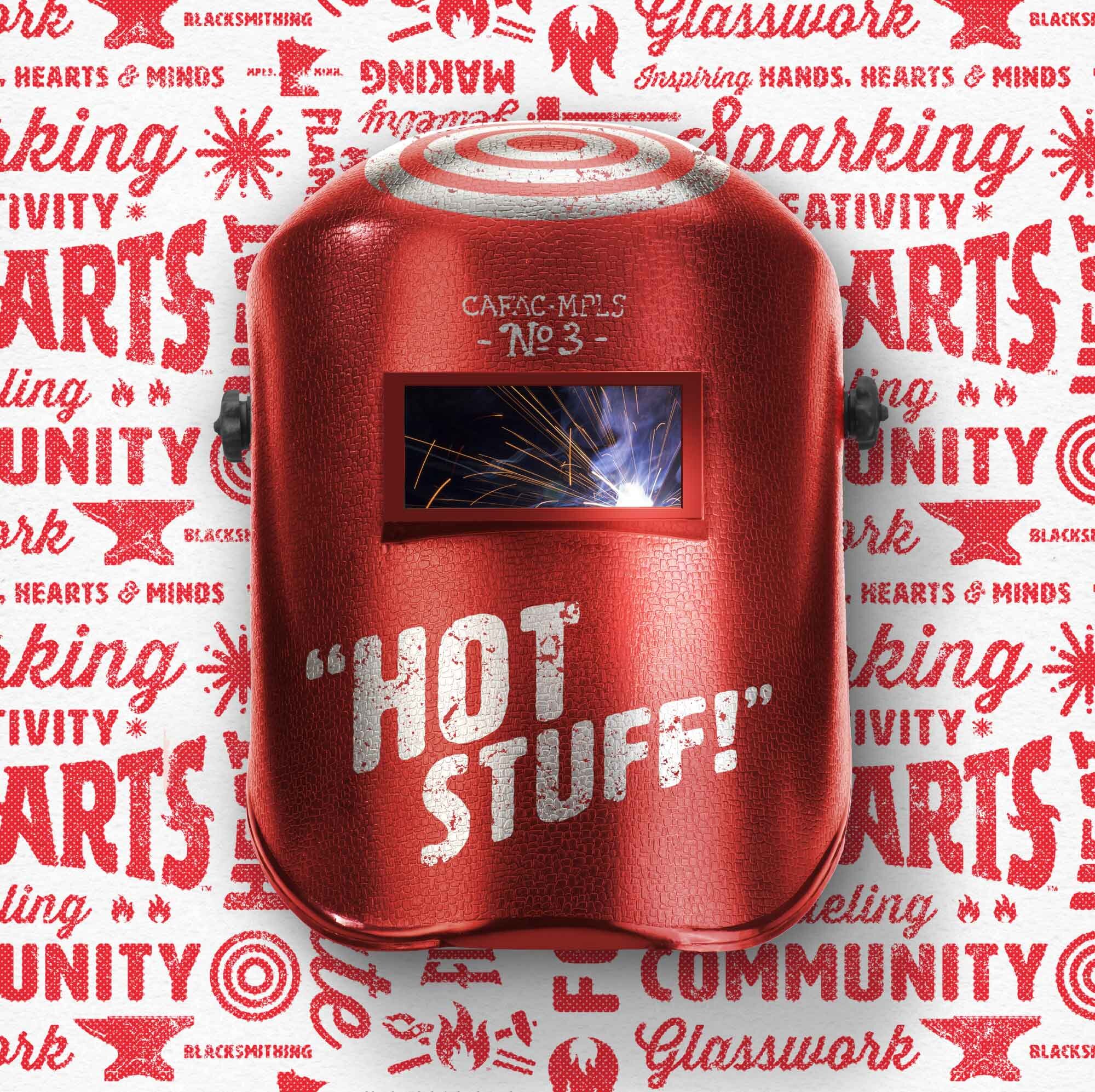
Sparking Creativity.
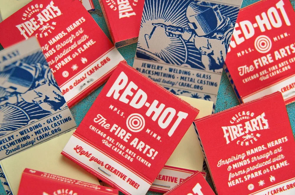
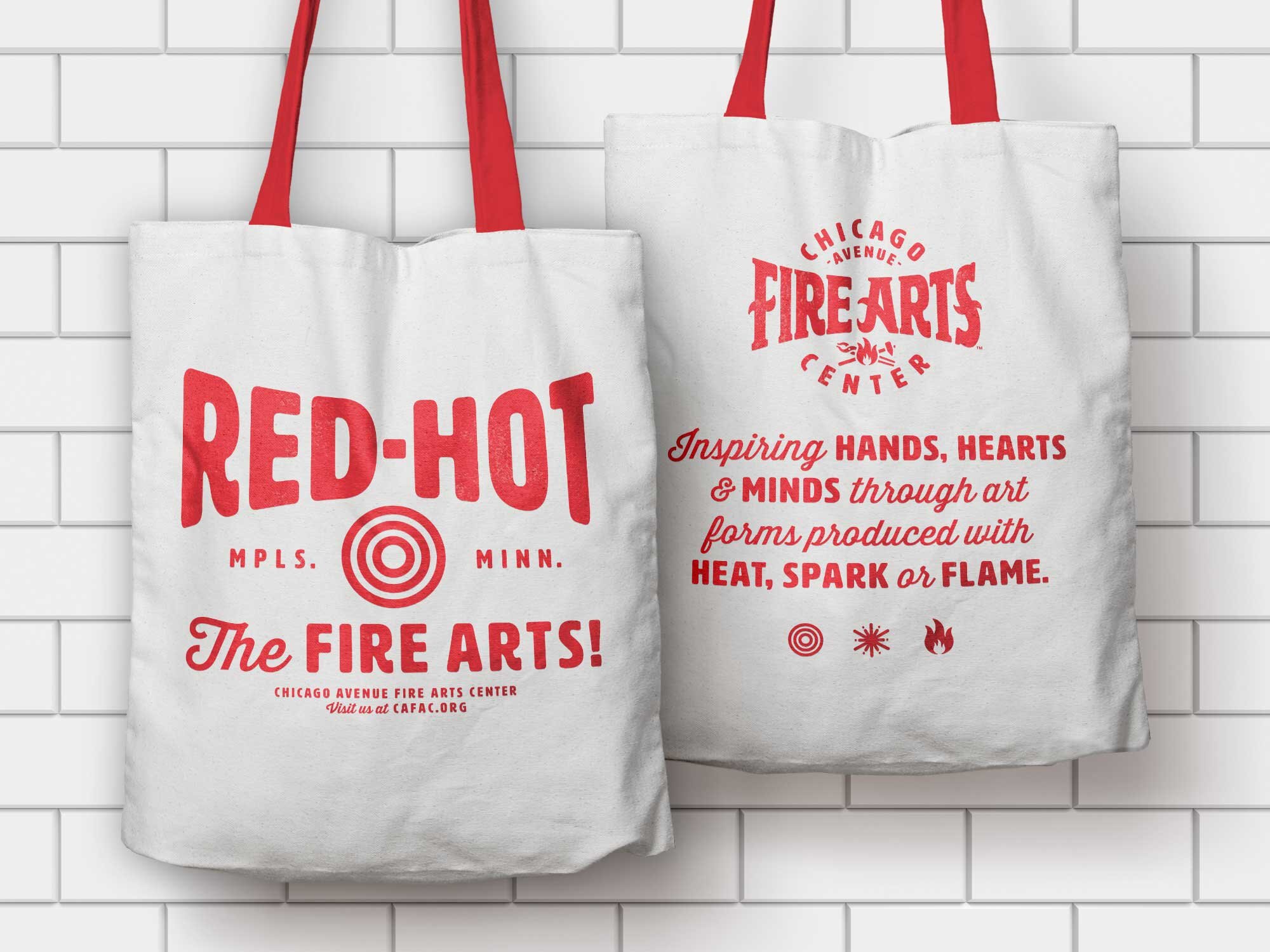
TIF met with the folks at the Fire Arts Center to get immersed in what they do and to fully understand their history, aspirations and how the organization has changed over the first 5 years in response to stakeholders. Accordingly, the new identity is gritty but approachable, like an inspired blacksmith with a grin on their face. The hand-drawn logo typography speaks to the hands-on, DIY, nature of the Fire Arts Center’s programs. To ensure that the visual identity would be flexible and vibrant, we crafted a suite of elements that can be applied to any future communications—from business cards to digital media and wearables.


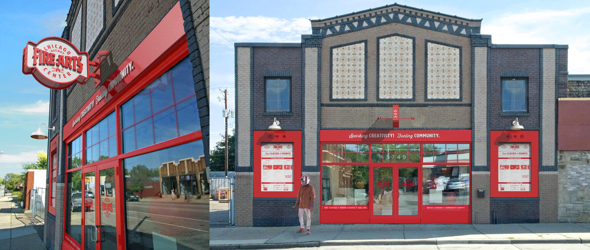
Fueling Community.
CAFAC and TIF wanted to bring the brand out on to the street to help bring more vitality to this corner in South Minneapolis. We wanted the signage to be an asset to the community, a compliment to the building and an invitation for everyone to come on in. Window graphics were designed to highlight the programs the Fire Arts Center offers, while the event signage system allows for cost-effective updates for upcoming classes, shows and Hot House events.


CAFAC logo design exploration.

From CAFAC.
“Working on our logo with Holly and John was a huge learning experience, not only about ourselves and our brand but about the process. We began with some really creative processes to determine who we were to ourselves, to our customers, to all of our stakeholders. They were so patient with us as we went back to the drawing board to get it perfectly right. And then they kept going – giving us all the tools we needed to use our logo perfectly and giving us ideas we never even thought of. Working with This is Folly was fantastic and we love our logo.”
— Susan Haugen, CAFAC President
“I truly enjoyed the experience of dialing in our perception of not only our initial mission, but who we have become as an organization. It was illuminating to see how each element in the logo design reflected the aspects we felt were important. The visceral reaction to the logo is dead on for everyone we've shared it with. It is thoughtful, well-crafted work.”
— Heather Doyle, CAFAC Artistic Director

