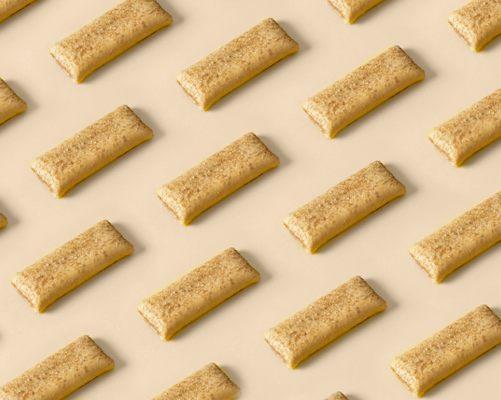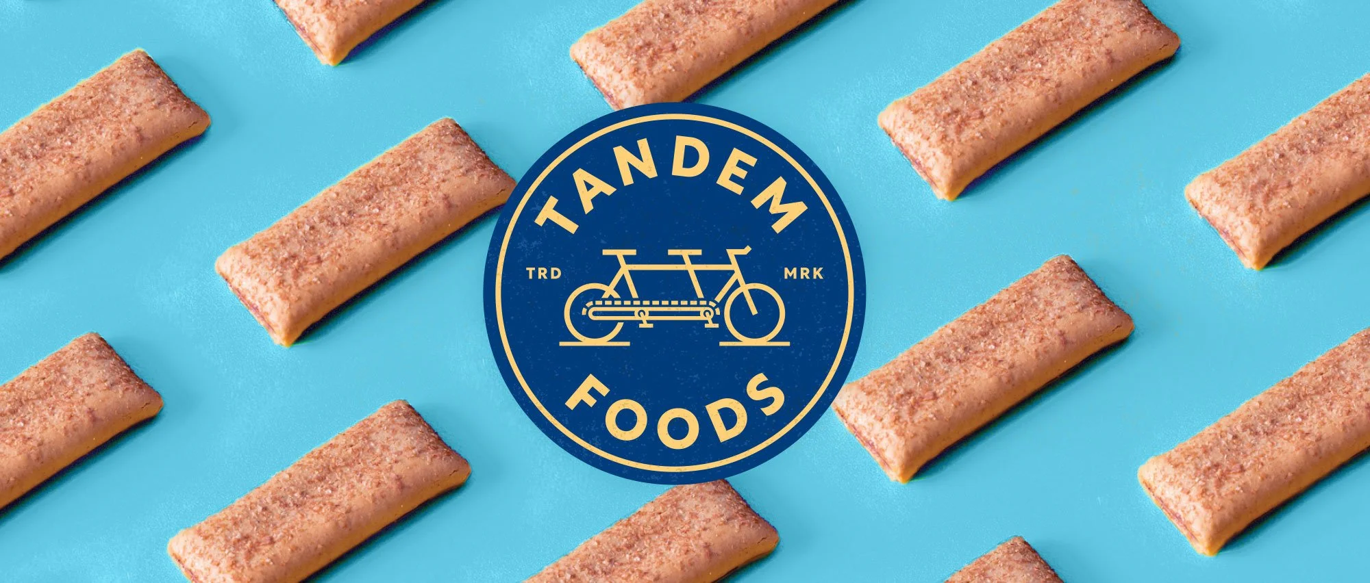
Blue and gold Tandem Foods emblem with tandem bike artwork and pattern of nutrition bars on blue in background.

Tandem Foods / Merger Rebranding

In Tandem.

With the announced merger of two contract bar manufacturing companies, a new brand name and visual identity was needed for the newly combined company. We again worked with the naming gurus at Pollywog. This Is Folly jumped on with a visual brand that represents the essence of this new food manufacturing powerhouse. The tandem bicycle, along with a symbolic manufacturing line chain, represents the power of collaboration with their clients, and the benefits of combining the resources and expertise of two companies into one new brand.

Work & Credits

Our Work: Brand naming participant, visual identity, visual culture & identity guidelines

Project Partners:
Naming:
Pollywog Inc.

Animated gif introducing the merger and the power of collaboration via a tandem bike.

The Power of Us.

The tandem bicycle represents teamwork in motion, suggesting the synchronization of two entities through trust and shared goals. The new company and their clients are moving forward together into a new shared adventure.
Blue and gold Tandem Foods emblem with tandem bike artwork.
Gold and blue Tandem Foods emblem with tandem bike artwork.
Vertical Tandem Foods logo lockup with blue bike artwork and type on white.
Blue and white Tandem Foods emblem.
Blue Tandem Foods bike logo mark and horizontal logo lockup with type on white.
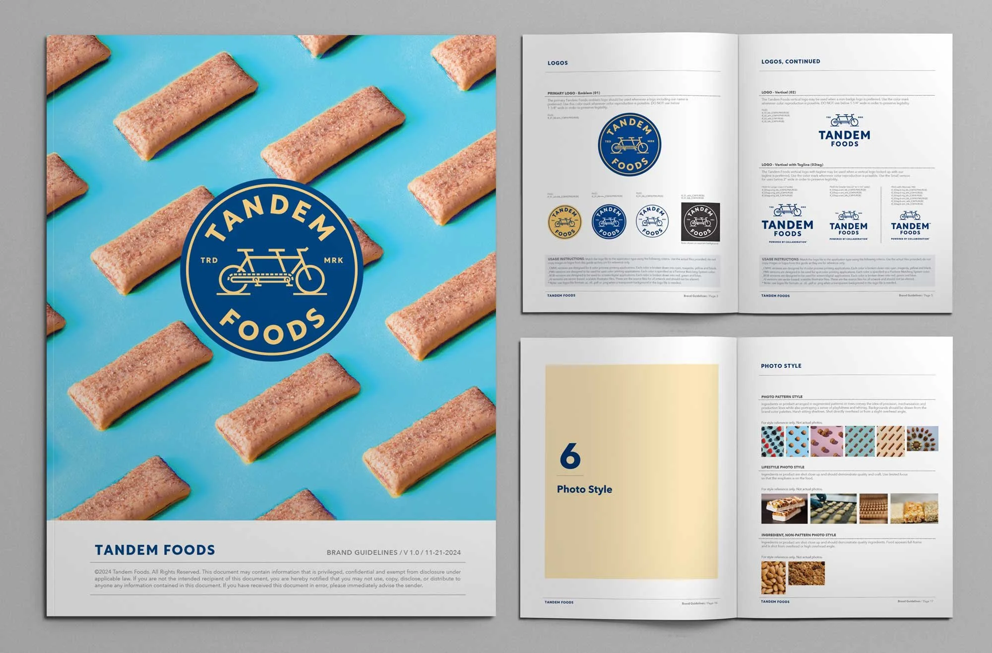
Colorful Tandem Foods brand guidelines cover and interior spreads show logos, and photography styles.
Blue and white pattern with Tandem Foods and tandem bike artwork.
Blue and gold pattern featuring tandem logomark.
Gold and blue pattern featuring tandem logomark.
Blue “Powered by collaboration” tagline on cream background.
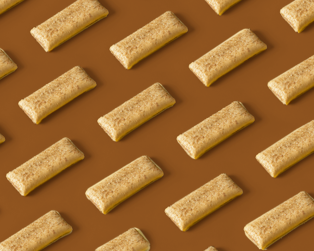
Pattern of nutrition bars on tan background.
Pattern of nutrition bars on brown background.

All The Moving Parts.

We developed a robust kit of brand parts that empowered the client to utilize their brand for all their communication needs. The launch of the new brand helps establish the brand meaning and a shared corporate culture, mission and values beyond just establishing the look and feel of the brand.
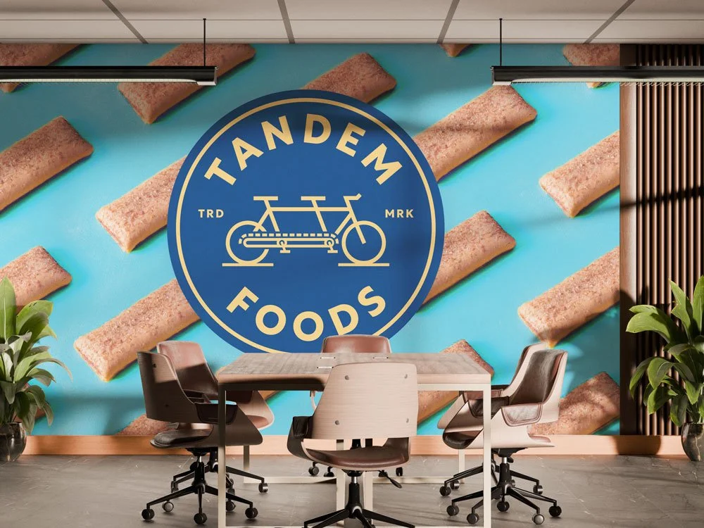
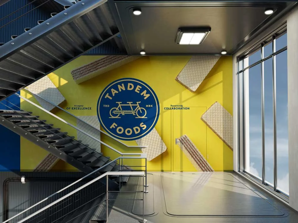
Office boardroom with graphic wall featuring blue and gold Tandem emblem over pattern of nutrition bars.
Office stairwell with bright colored graphic  wall featuring blue and gold Tandem emblem over photo of wafer bars.
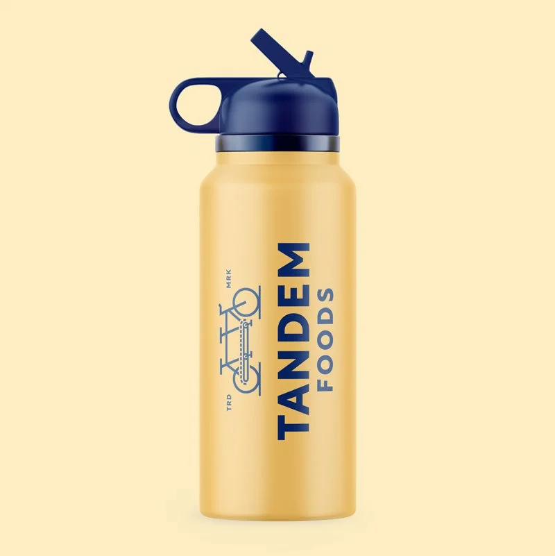
Gold water bottle with blue vertically stacked Tandem logo. Bottle with blue cap on tan background.
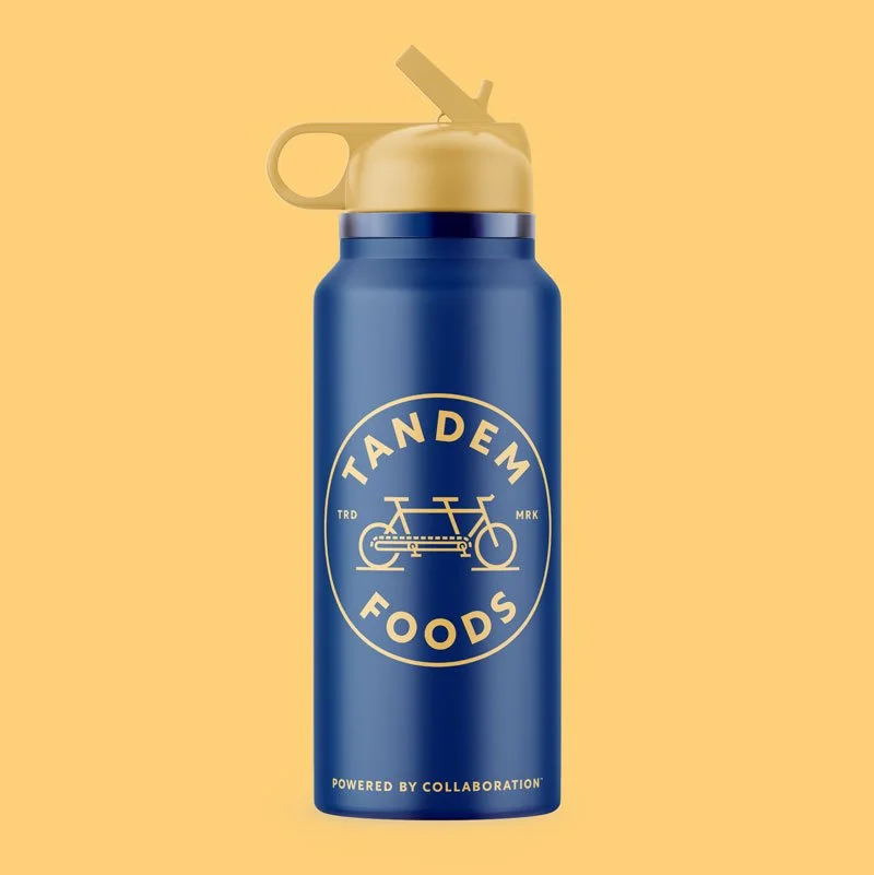
Blue water bottle with gold Tandem emblem and tagline. Bottle on gold background.
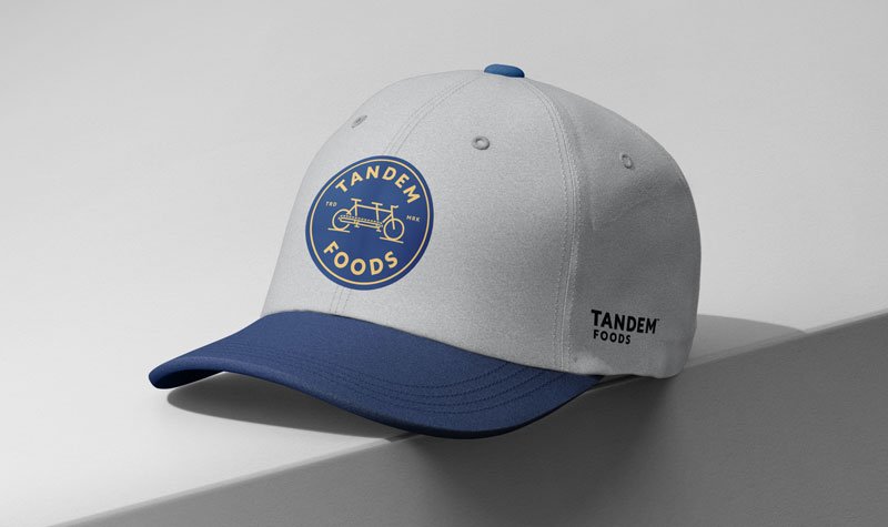
Light gray and blue cap with blue and gold Tandem emblem.
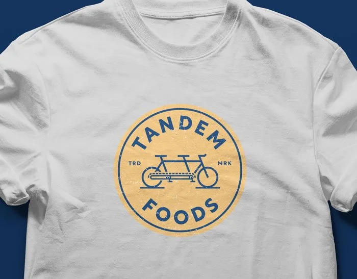
Gold and blue emblem on a white t-shirt.
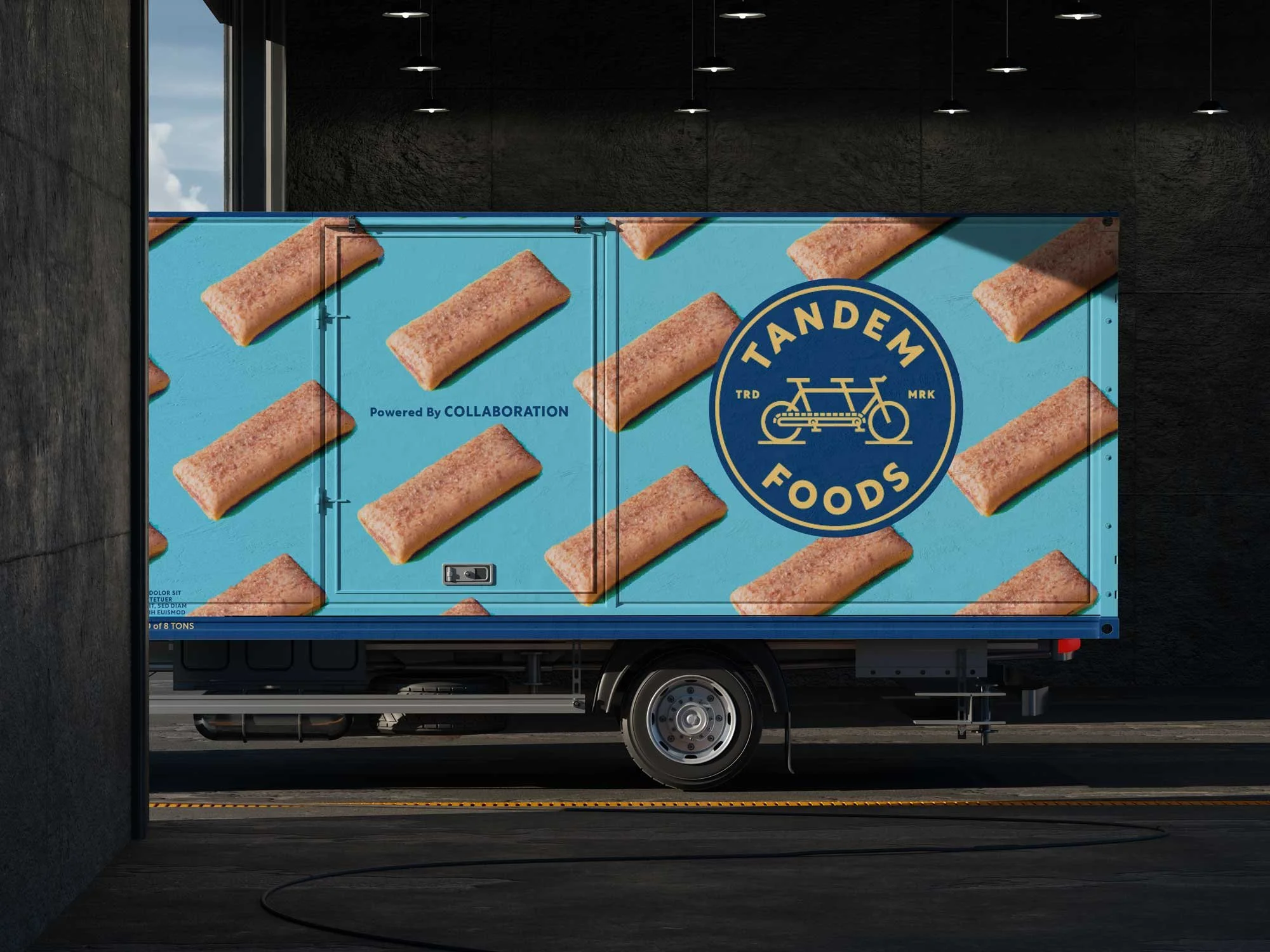
Box truck wrapped with brand graphics including blue Tandem emblem over pattern of nutrition bars over bright blue background.

Inside The Process.

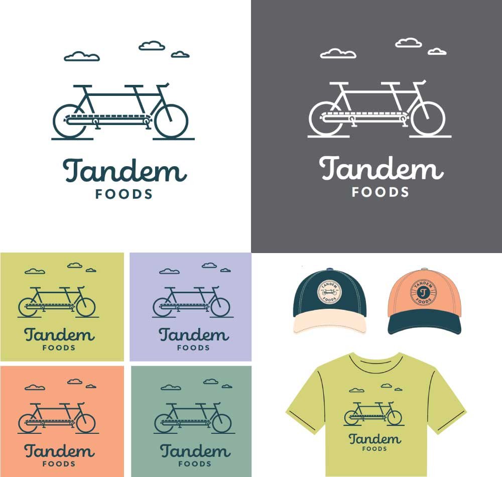
The client requested that we explore identities for a final short list of names to help them explore the potential of each name and brand before they landed on a final direction.
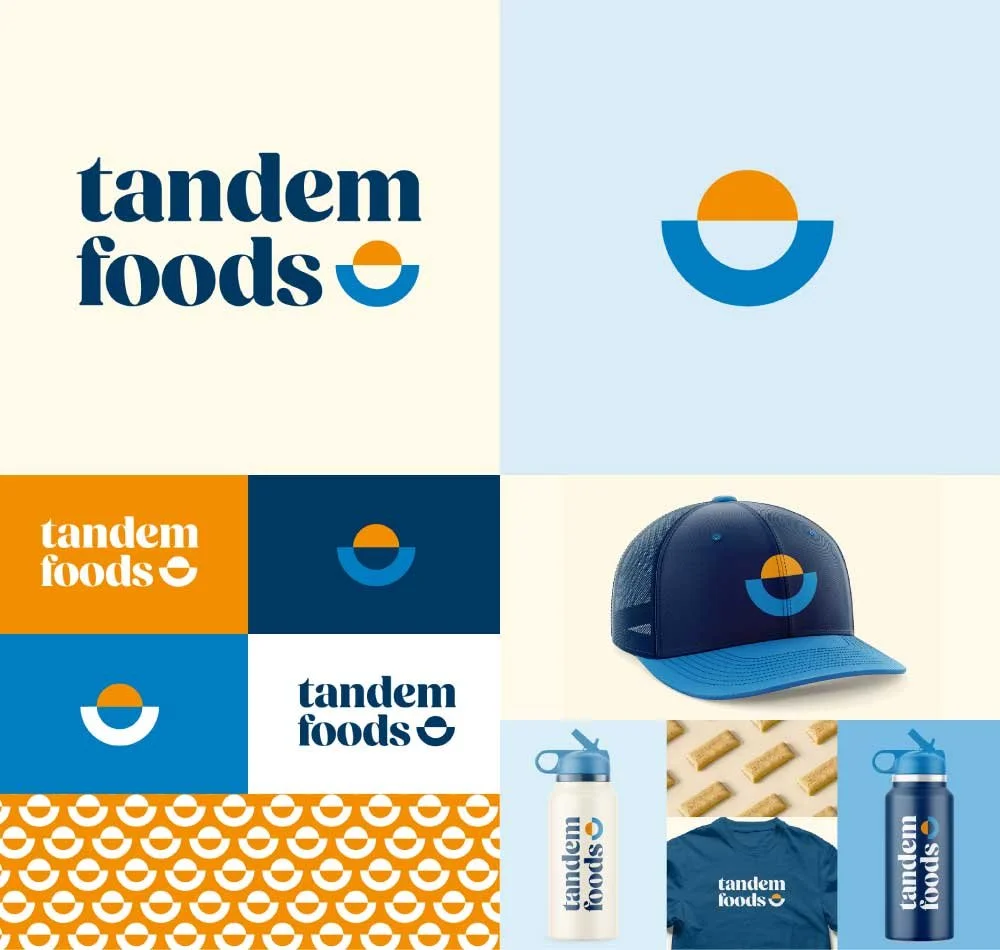
Early Tandem Foods concept featuring colorful blue and orange half circle, rising sun logomark.
Early Tandem Foods logo with whimsical colors and cloud artwork.
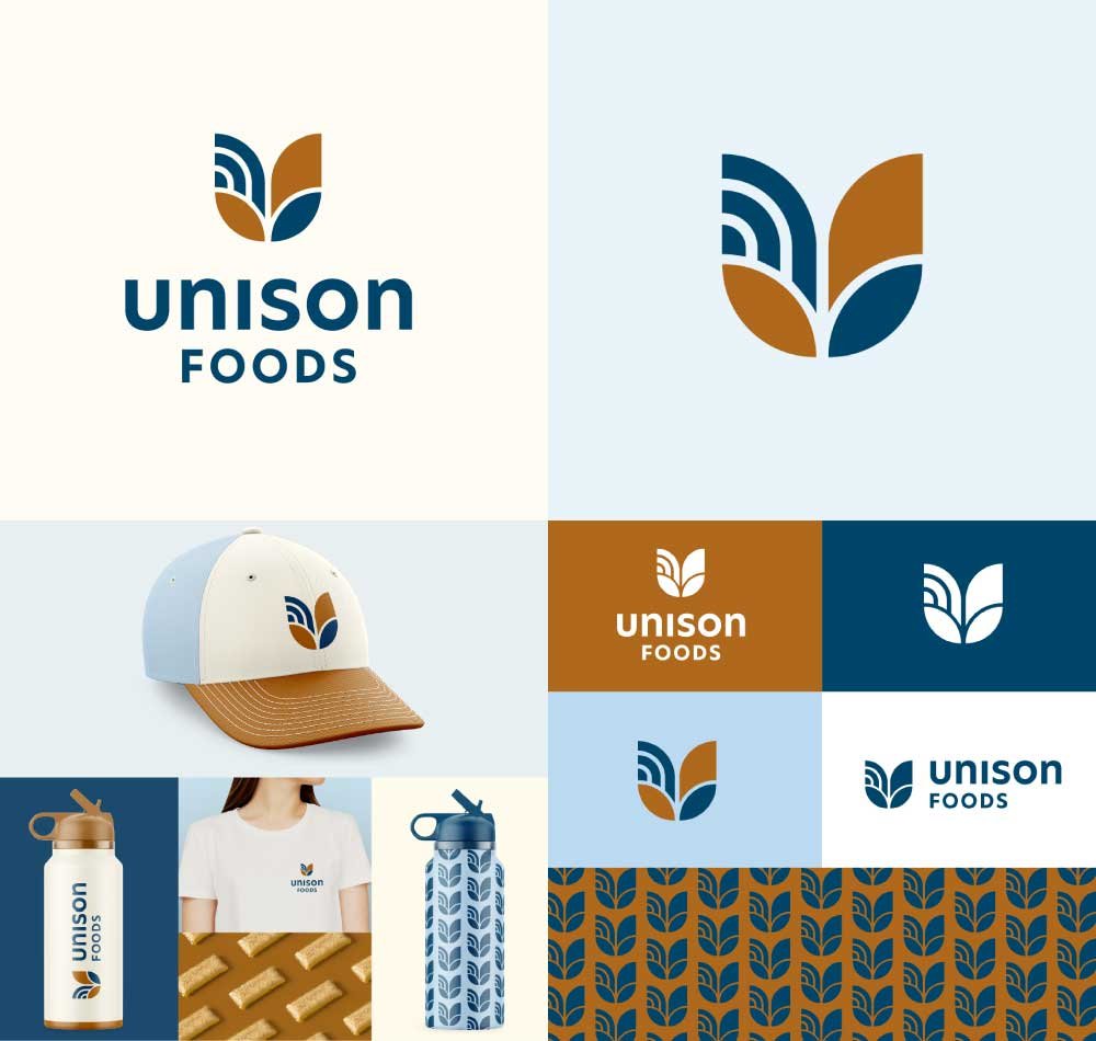
Blue and rust brown Unison Foods logo concept. Abstract geometric plant and sun logomark in the shape of a “U”.
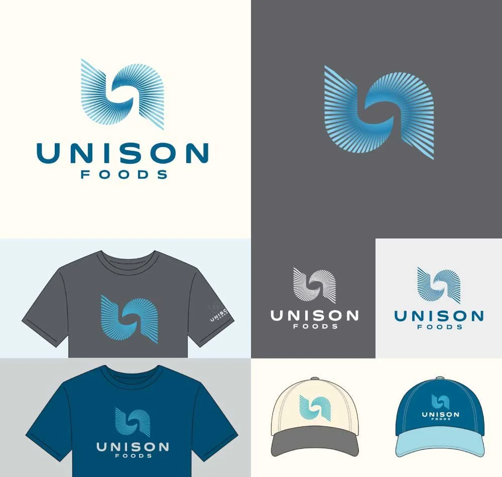
Early Unison Foods logo concept with radiating, rotating lines that can be seen as abstract “U” or spoon in mixer.
dot pattern divider
 
Thumbs up graphic with blue background.

“Thrilled with the Outcome! We can’t thank you enough for everything! Our customers, employees, and board of directors are so excited to be unified under one name—with such a fantastic new name, logo, and story to match.”

—Michael Buick, CEO of Tandem Foods

 
Dot pattern divider
 

Related Work


We Got the Power.

Happy Human branding and identity

A Happy Fit.

 
Next
Next

GO WESTopolis.